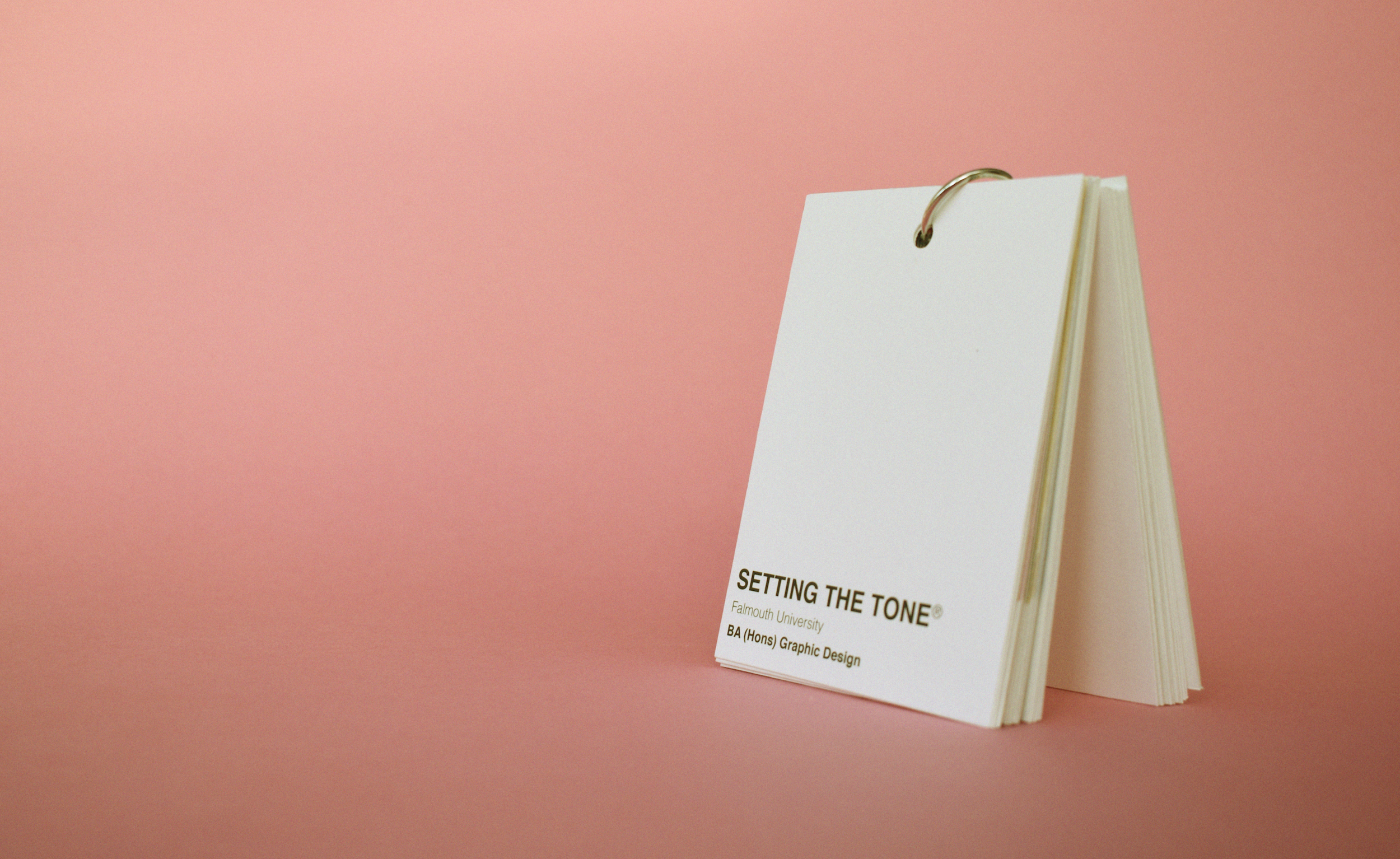
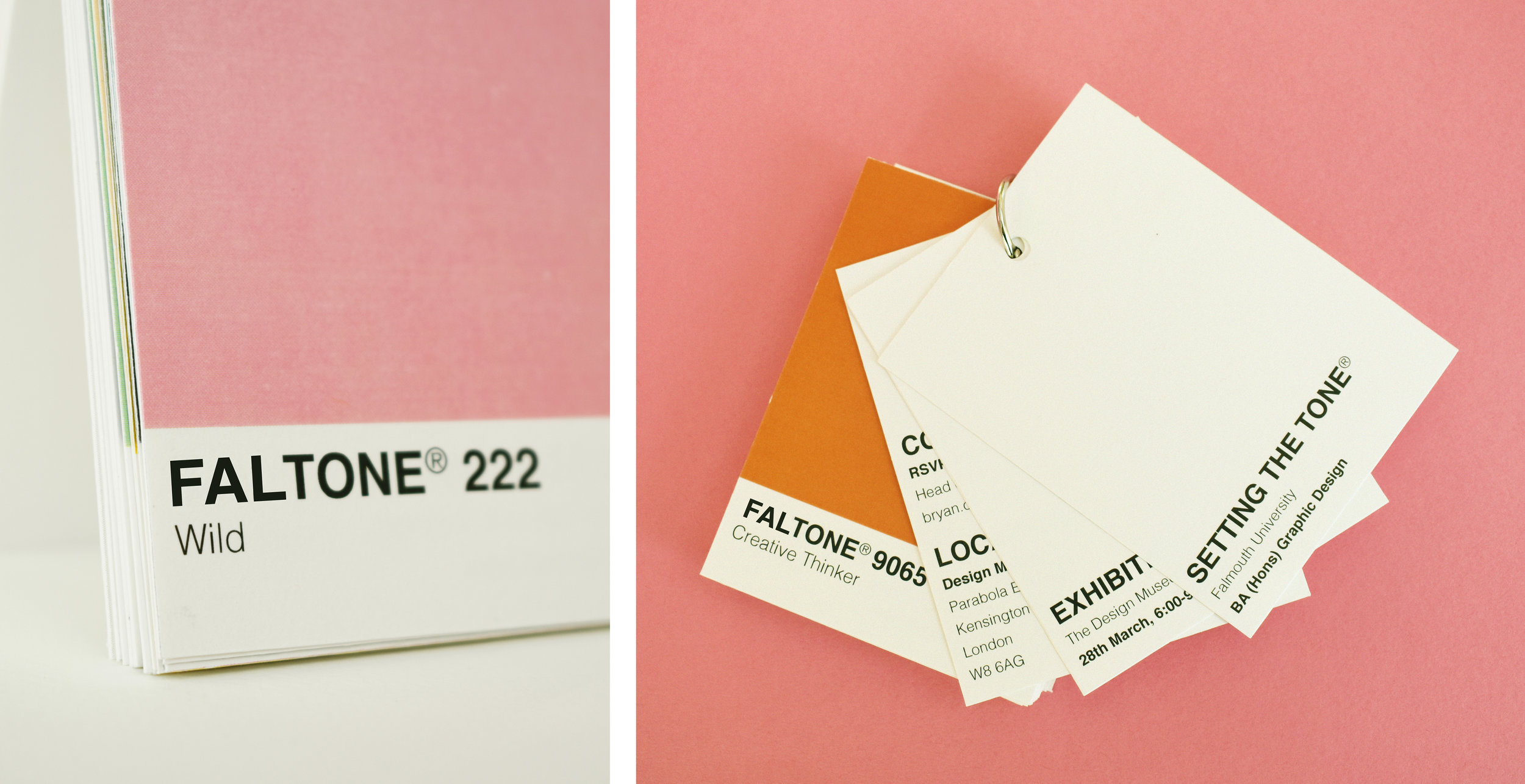

Faltone was a proposal for the design of the invitation that would be sent out to graphic designers, inviting them to Falmouth Universities graphic design portfolio review at the Design Museum.
Our Concept is inclusive of everyone on the graphic design course. It may look like a lot, but actually it’s pretty simple. We’re ‘setting the tone’ before the big event!
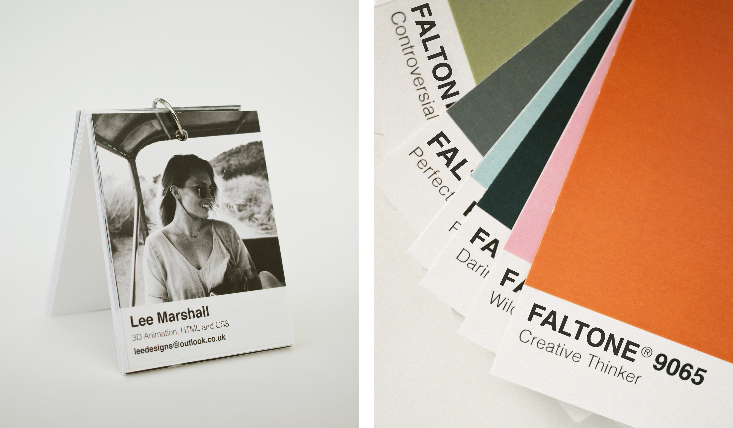
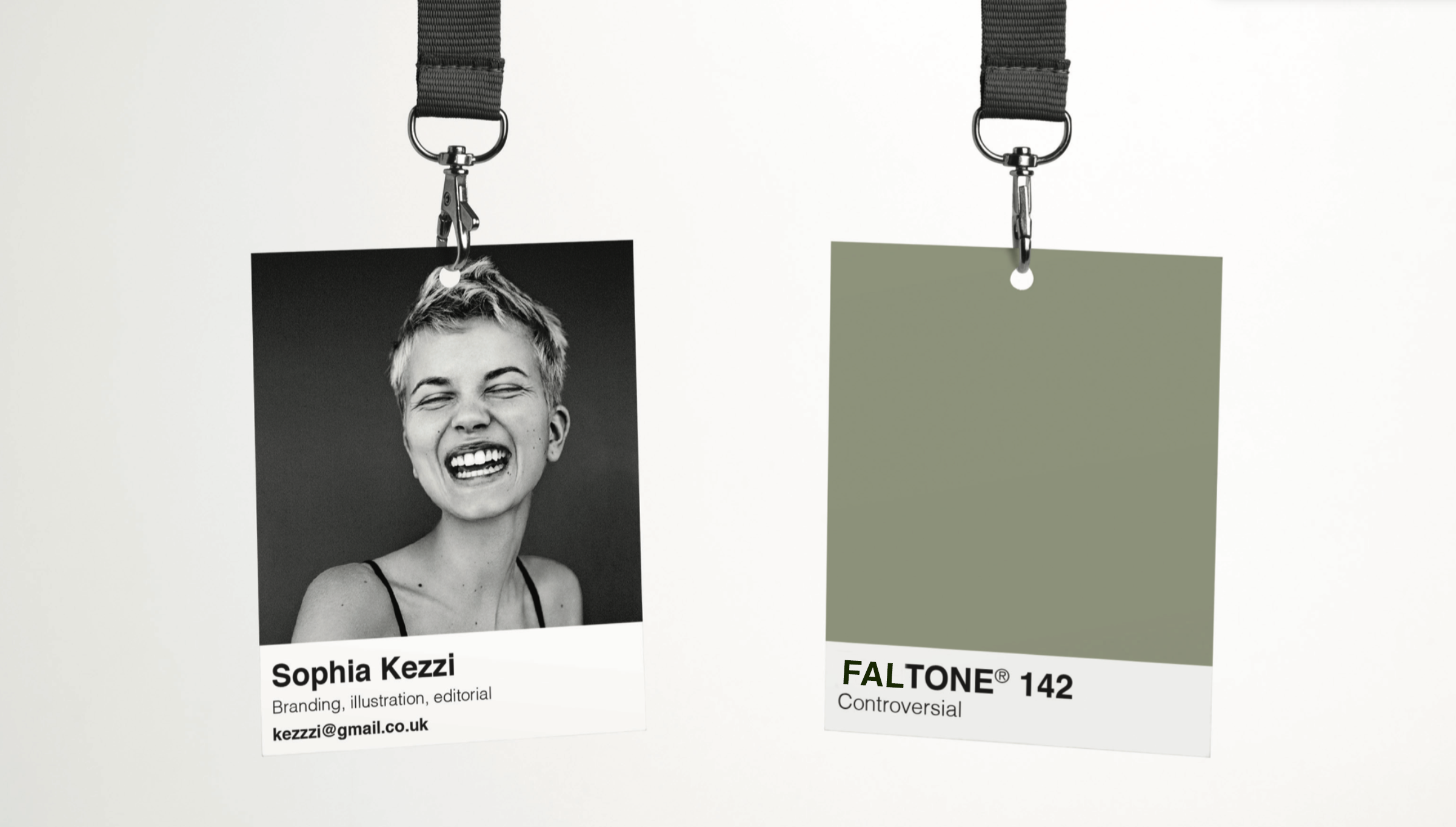
The swatch cards are a play on the idea of Pantone swatches, the cards will feature each student attending the exhibition. As well as their: favourite colour, 3 refined skills (just what you enjoy), their email, and a photo.
The swatch card will be double sided, a photo of you on one side and your favourite colour on the other. These can then be worn at the exhibition and the agencies/designers can come and find you. It’s a big conversation starter, sparking questions about your chosen colour and 3 areas of graphic design you enjoy/want to pursue a career in.